Committed to visual art of originality and excellence
Image Reproduction on Computer-Related Displays and Printers
From scanning to encoding, every effort has been made to maintain image and color faithfulness from the original photograph to the image you see on your screen, within the constraints, budgets, and technical limitations existing. Most computer video cards, color monitors, printers, and other display devices (especially handheld/PDAs/wireless phones) will yield varying levels of resolution quality and/or color rendering. The actual original artwork, logo, or product coloring may vary from the computer-displayed images you see.
Thumbnail (small) samples have necessarily been optimized for web and modem transmission efficiency (speed of download), and thus color maps have been restricted and resolution minimized. Non-thumbnail images are usually limited only by the encoding format (.gif or .jpg) color map of 250-256 colors, and disk space requirements.
 |
The biggest culprit for color mismatches and inaccuracies is the lack of calibration on the display device you or your customers are using. See the airplane TV monitor discrepancies to the left - when viewing only one (isolated) display the human brain acclimates readily to the inherent color balance (incandescent vs. fluorescent ambient lighting for instance) differences, so after the first few seconds, the brain "accepts" and recognizes the image context for what it functionally is and adjusts to a yellow face, for instance. Of course, when displays are compared side by side, the color differences are striking. |
So the bottom line is that we do the best we can to target an "average" monitor (whatever that is!) and hope for the best. Most of the viewing public is accustomed to video and audio imperfections. (Sadly, due to cable and internet TV compression, we all have come to accept poorer quality than technology is capable of offering.)
Tip for a FREE high-level adjustment of your computer monitor. (You'll need to check the instructions for your particular model for how to adjust the brightness and contrast.)
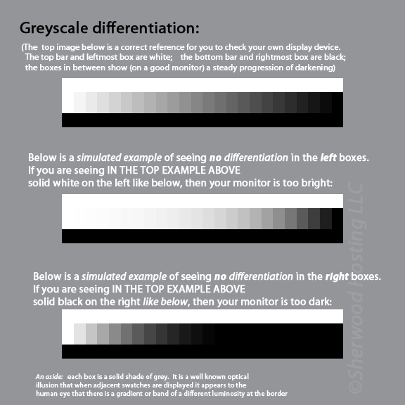
Greyscale differentiation for a graduated series of increasingly dark swatches is a good measure to see if your monitor is in the ballpark of being calibrated.

Using the topmost reference band of graduated grey swatches above:
(the bottom two are distorted examples to try to demonstrate what a poor monitor would display)
STEP ONE
First, adjust screen contrast to maximum, then reduce it until you see a separation between the white (the farthest left box is solid white) and the first very light gray box next to it.
STEP TWO
Then, adjust the brightness until you see a separation on the far right between the black (rightmost box) and darkest gray block (just to the left of that last black box). The black block (farthest right) should be as black as possible.
The above should get you into the ballpark for general black and white contrast, however, professional calibration tools and kits are available online to more precisely calibrate your display(s) for more nearly accurate color viewing, yielding a profile that your video card will use to compensate for the model and age of your monitor.
Note that most web content these days is taken by consumer cameras without any regard to color fidelity. So unless you're a graphic designer, photographer, color specifier, or branding identity consultant, you probably do not need precise rendering.
REFERENCES

